Response to: “Bad bibliometrics don’t add up for research or why research publishing policy needs sound science”
We have received a diverse, global, and humbling response to our preprint “The Strain on Scientific Publishing.” We thank everyone for the kind words, thoughtful commentaries, and critiques from across the spectrum. We embrace the opportunity to critically re-evaluate our positions and better our understanding of the data. This is Open Science at its best, and we fully support it.
A recently-published Frontiers Media “science news” blog commented publicly on our work. We read this piece with great interest, but were surprised to see this blog mischaracterize our work and the relationship we had with Frontiers in the lead-up to releasing our preprint. We feel the debate around our preprint is best left to the scientific discourse, including peer review; ultimately the worth of our work to the scientific community at large will be judged by the utility that it provides to understanding the academic publishing landscape.
However, we feel compelled to publicly reply to this blog piece as it contains factual errors, distorts our work, accuses us of editing, cutting and omitting data to produce biased results. These accusations are particularly hideous to make of scientists. Frontiers’ blog further produces an alternative analysis that partly does not stand up to scrutiny, and partly supports the very results it claims to debunk.
Here we provide a response focused on the most salient points. We must reply to the claims made about our character seriously: we did not cut, distort, omit or edit any data. Here, we will set the record straight and dispel the derogatory accusations contained in Frontiers’ piece. Without further ado:
1. Frontiers data claims
First: we were surprised to see Frontiers claiming they had shared data with us. We asked them for data on several occasions between April-September 2023, and while they always responded with “we’re working on it,” they never provided us any of the data we requested on special issue articles, turnaround times, or rejection rates. So to be clear: we requested data from Frontiers such that we could validate our web scraping, but they never shared those data with us.
“In fact, using the same data Frontiers provided the preprint authors as well as the correct original Scopus data, we do not find any correlation between total number of articles and the number of special issues articles (Figure 2C).”
- Frontiers
They did send us a personally-curated set of Dimensions data in August 2023. They did so after we shared a draft of our preprint prior to its release. Here’s a screenshot of the full extent of the data Frontiers sent us:
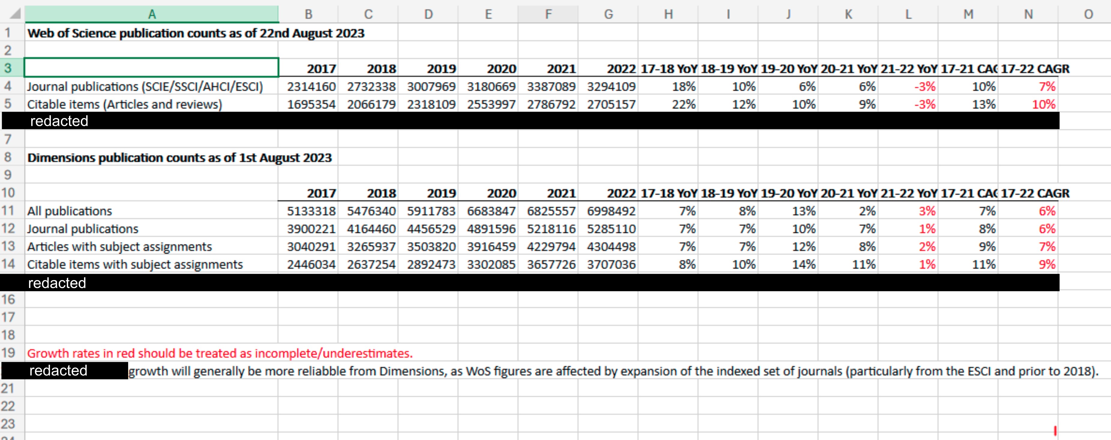
We have redacted rows in this spreadsheet that focused on another publisher. We didn’t ask Frontiers for Dimensions data, and we are also quite capable of curating data for ourselves. We opted to use a conservative dataset where all journals in our analysis were indexed by both Scopus and Web of Science (downloaded from Scimago), such that the growth in articles we described would relate solely to journals indexed by both industry heavyweights. We acknowledge in our study that there are even more journals out there, for instance, journals indexed by Dimensions but not by both Scopus and Web of Science, and so the strain we describe is likely an underestimate.
Second: Frontiers writes that we “resorted to unverifiable data obtained through web scraping”.
“The authors resorted to unverifiable data obtained through web scraping, which means that the study and its conclusions were predicated on an incomplete and unbalanced dataset of publisher activity.”
- Frontiers
For our preprint, we scraped data on shares of special issues and turnaround times. However, our data on the number of published articles and on the number of newly-minted PhDs and world researchers – the core of Frontiers’ rebuke – were downloaded from publicly available, official data (via Scimago, OECD, and UNESCO as sources). This is not hidden but plainly stated in our preprint.
Third: Frontiers writes “When contacted for access to their dataset, the authors responded that they had”embargoed” their data, with the result that no one can verify or replicate their findings”.
“When contacted for access to their dataset, the authors responded that they had”embargoed” their data, with the result that no one can verify or replicate their findings.”
- Frontiers
We have norecord of Frontiers requesting our dataset. Our data and scripts are uploaded to FigShare, and this data deposition is even visible publicly. While the data are indeed currently under embargo, the fact that they are deposited this way not does not make them unverifiable, but the opposite: it makes them accessible to journal staff and peer reviewers. Thus, this statement by Frontiers is untrue on both counts: we were not contacted for our data, and our results can indeed be replicated and verified, just not publicly.
So why are the data under embargo? We have consulted with lawyers at our respective institutions throughout this process regarding our data management ethics and responsibilities. Unfortunately, we simply cannot release our web-scraped dataset. The reasons for this are disappointing but sensible: those articles and the metadata contained within belong to the publishers; they are not ours to redistribute. We have a right to scrape and analyse them, but not to share them further without the publishers’ authorisation. Now… if Frontiers authorised us to release the web-scraped data that we collected from them, we could do that immediately.
But!!! While the raw data are not available, we are free to disclose analyses carried out on them. In this regard, we have an exciting announcement: we’ve just released a web app (in beta) that lets you explore data that we can share in a fully-customizable way! See the announcement here.
2. Straw men, or: what we actually said vs. what Frontiers claims we said
Frontiers claims we said many things we simply never said. We encourage readers to actually read our manuscript to see what it is we do say. Below we give a brief summary of some of the many straw men populating Frontiers’ piece.
Sampling of Frontiers statements:
“The study posited that the scientific community is under strain due to a declining workforce and an exponential increase in published articles, caused by special issues in open access journals.”
“Attributing the growth of scientific output solely to gold open access publishers […].”
“It is clearly flawed to single out the shift of academic publishing towards open access as the sole driver of increase in scientific output […].”
Almost all of that is a straw man.
We don’t say the workforce is declining, we say (in the Abstract): “Total articles… have grown exponentially… which has outpaced the limited growth – if any – in the number of practising scientists.”
We never attribute the growth to a single factor – the very aim of our study is to propose five indicators of strain covering different factors. Also, (from the discussion): “The strain we characterise is a complicated problem, generated by the interplay of different actors in the publishing market”.
We never attribute the growth solely to gold OA publishers. Instead, we highlight at least two broad models, stating (in the Discussion): “the amount of strain generated through these two strategies is comparable”; we indicate several problems over our five indicators. In fact: we openly and clearly write this (from the Discussion) “regulating behaviours cannot be done at the level of publishing model. Gold open access, for example, does not necessarily add to strain [...].”
These are two things we do say though:
That growth in yearly published papers is exponential, and
That the number of researchers has not kept up with that growth
Frontiers claims these are “false pillars of strain”, suggesting instead that the growth in articles we described is linear, and that the number of scientists over time has seen “a continuous increase.” We will give these suggestions the scrutiny they deserve.
Linearity
First, it bears saying: “Humans tend to systematically underestimate exponential growth and perceive it in linear terms” (Frontiers in Psychology, 2023). With this in mind… Frontiers suggested growth in articles was linear by… saying so. While criticizing us for not performing “scientific analysis”, their analysis can be summed up as showing plots and saying “it’s linear!”
However, we ran the stats on this, and over our study’s time period, a linear model is a good fit (R2 = 0.93) but an exponential model is an even better fit (R2 = 0.97, below). Indeed, we reported a mean year-over-year growth of ~5.6% over the period 2016-2022. The bizarre thing is… Frontiers also annotated a 6% year-over-year growth in their Dimensions data from 2017-2022 (above: see the Dimensions data they shared).
Constant absolute growth is linear. Constant year-over-year percent growth is exponential. So in fact, we both agree? The data are exponential. Below we have provided plots of our data with linear or exponential curves annotated, and provided formulae and model fits for both models.
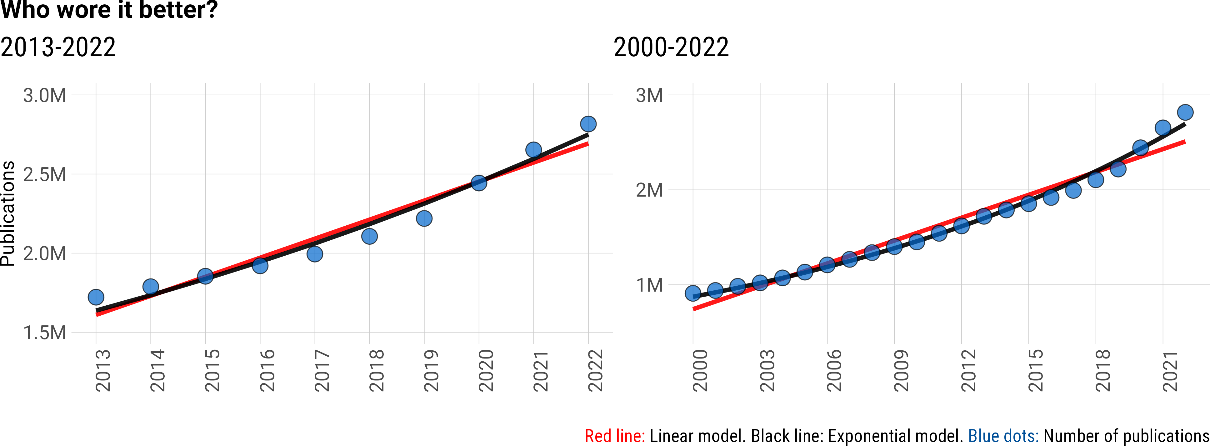
Who wore it better? Linear (red), or exponential (black)?
“Humans tend to systematically underestimate exponential growth and perceive it in linear terms, which can have severe consequences in a variety of fields.”
- Melnik-Leroy, Gerda Ana, et al. “Is my visualization better than yours? Analyzing factors modulating exponential growth bias in graphs.” Frontiers in psychology 14 (2023): 1125810.
| Model | 2013-2022 | R2 | 2000-2022 | R2 |
| Linear: ax + b | ax = 120379 * yr b = -240712967 |
0.93 | a = 80319 * yr b = -159895398 |
0.96 |
| Exponential: abx | a = 1.637*106 bx = (5.76* 10-2) (yr - 2013) |
0.97 | a = 8.74*105 bx = (5.12*10-2) (yr-2000) |
0.99 |
Decline of the number of researchers
Again, we never claimed a decline. From our abstract: “Total articles… have grown exponentially… which has outpaced the limited growth – if any – in the number of practising scientists.”
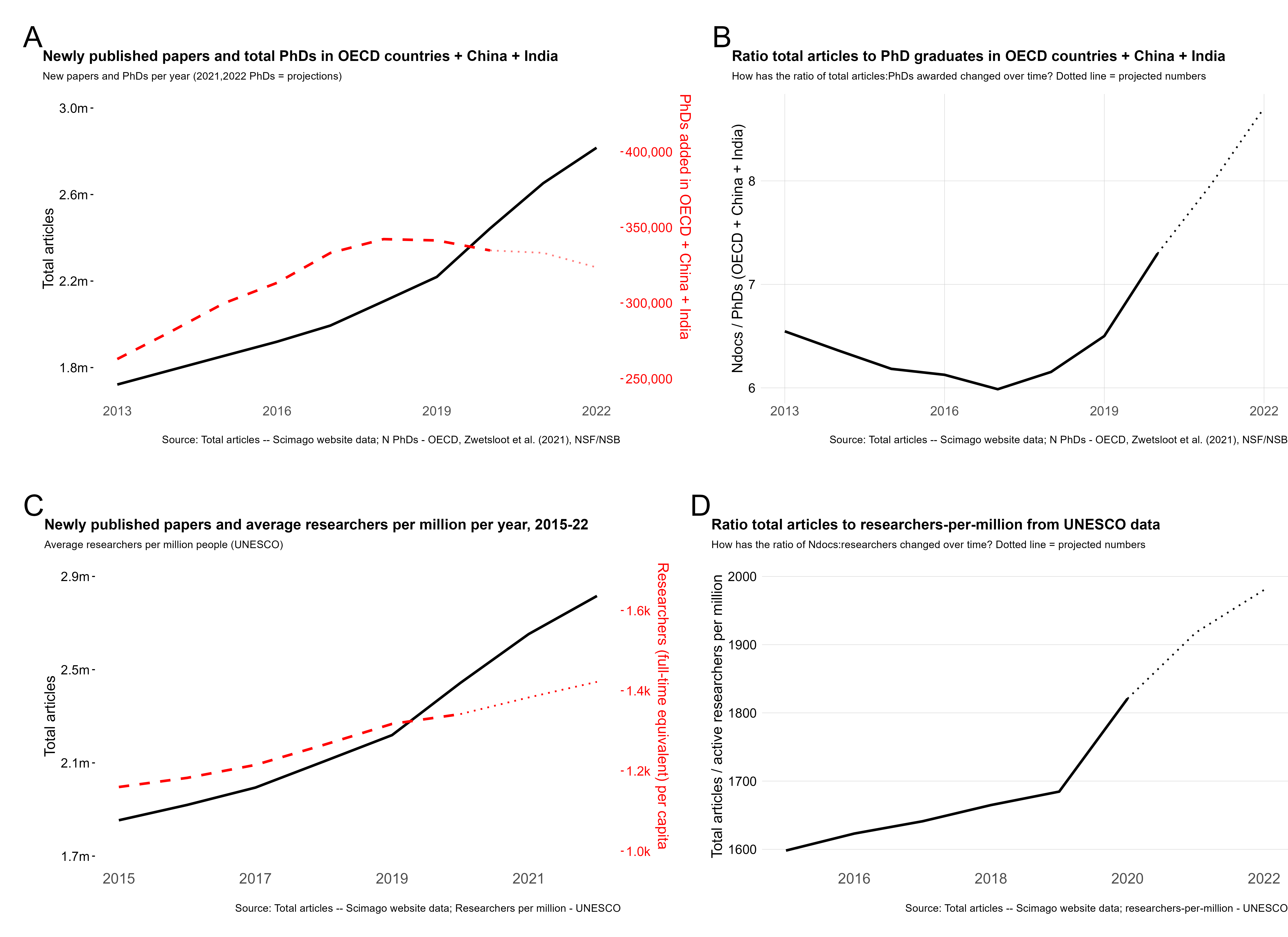
Some of our plots do show a decline in the number of new PhDs per year. A lower growth rate does not create an absolute reduction – as people all over the planet facing slower inflation this year surely know. Further, we did consider different data types and sources to pin down the growth in the global scientific workforce: some show a plateau, some show only a limited rate of growth. That’s why we said “growth in articles outpaced the limited growth – if any – of researchers”. It’s what the data (from several sources) tell us. Here is our Fig.1supp1, which uses OECD PhD data supplemented with data for India and China (A-B), or UNESCO data on researchers-per-million (C-D):
So, what did we actually say?
We claim, and document, that strain is a real problem, and while it’s not a new problem, it’s become seriously overwhelming in the last few years. We explicitly discuss how two main mechanisms have generated this strain: i) A steady growth in total journals, and in articles per journal, by legacy publishers like Elsevier and Springer. ii) An explosion of articles by publishers adopting special issues as a format to publish the majority of their articles, such as MDPI and Frontiers. In our discussion, we further emphasize these two mechanisms as distinct contributors to strain, and at no point do we suggest that strain is caused by a single publisher or a single publishing behaviour.
Strain is caused by an industry that seeks to grow off the backs of a volunteer workforce that increasingly cannot keep up with demand to write, review, and edit new articles. Read that again and think of your life as a scientist. It resonates, right? What we did is characterize the constitution of that strain, synthesising data that are rarely considered collectively.
Finally, the straw man to bind them all
In their piece, Frontiers makes us out to somehow be “detractors” of the open science movement, setting out to falsely prove our pre-ordained views… while discussing our open access preprint. We are confident our record of public statements and publishing history firmly advocate for open science.
3. Of Bad bibliometrics that don’t add up
We struggled to come up with a delicate way to phrase this, but we simply couldn’t find the words. To be blunt: the Frontiers analysis is amateurish, careless in its data curation and interpretation, leans heavily on visual impressions, and evokes results out of thin air. Let’s dive in.
Frontiers claims:
“The proxy data was not reproducible and not representative of the original sources of Scopus and Web of Science. The original data does not show the claimed”exponential increase” in the total number of articles published during the study period (2013-2022), in fact growth is linear during this period (Figure 2A).”
First: Frontiers presents this plot of exponential historical article growth, which suggests that the total new articles per year has declined from 2021 to 2022 slightly in Dimensions and Scopus, and by approximately half a million articles per year in the Web of Science. Here is their Figure 1:
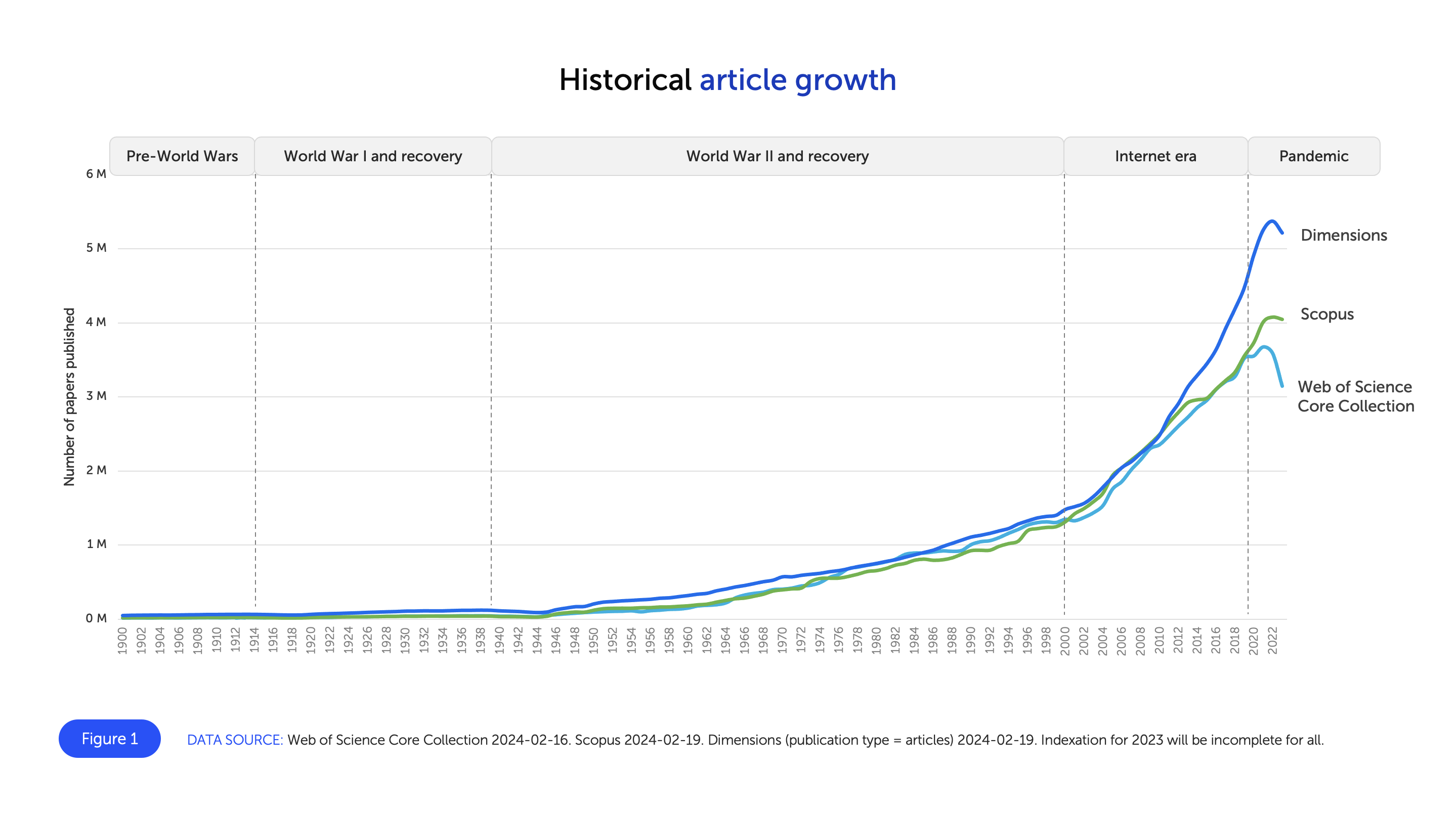
However, in their next plot in their Figure 2A (below, left), they instead show a year-over-year increase in the Dimensions and Scopus datasets, and only a minor decline in the Web of Science data. What Frontiers has done in Figure 1 is they have oversmoothed their curve, leading to a faulty data visualization that does not accurately reflect the underlying data.
Their Figure 2A also shows another problem with the analysis carried out by Frontiers, that will occur again later: they claim one thing in the text, provide no numbers in support, and simply reference a figure that, in fact, does not support the claim.
Look at the left panel below, and then the right panel. Frontiers claims that our data are “incomplete and selective” and that “employing reproducible data from original, verifiable sources painted a starkly different picture”. They then provide their Figure 2A, which we give here unaltered in the left panel below. In the right panel, we have cut and pasted the black line (our data) and moved it up so the 2013 data points are aligned between Scopus and “our data”. The growth rate is remarkably similar. This should not surprise anyone, because our data are Scopus data. We just filtered them to only include journals also indexed in Web of Science. They are not a “proxy, unverifiable source.”
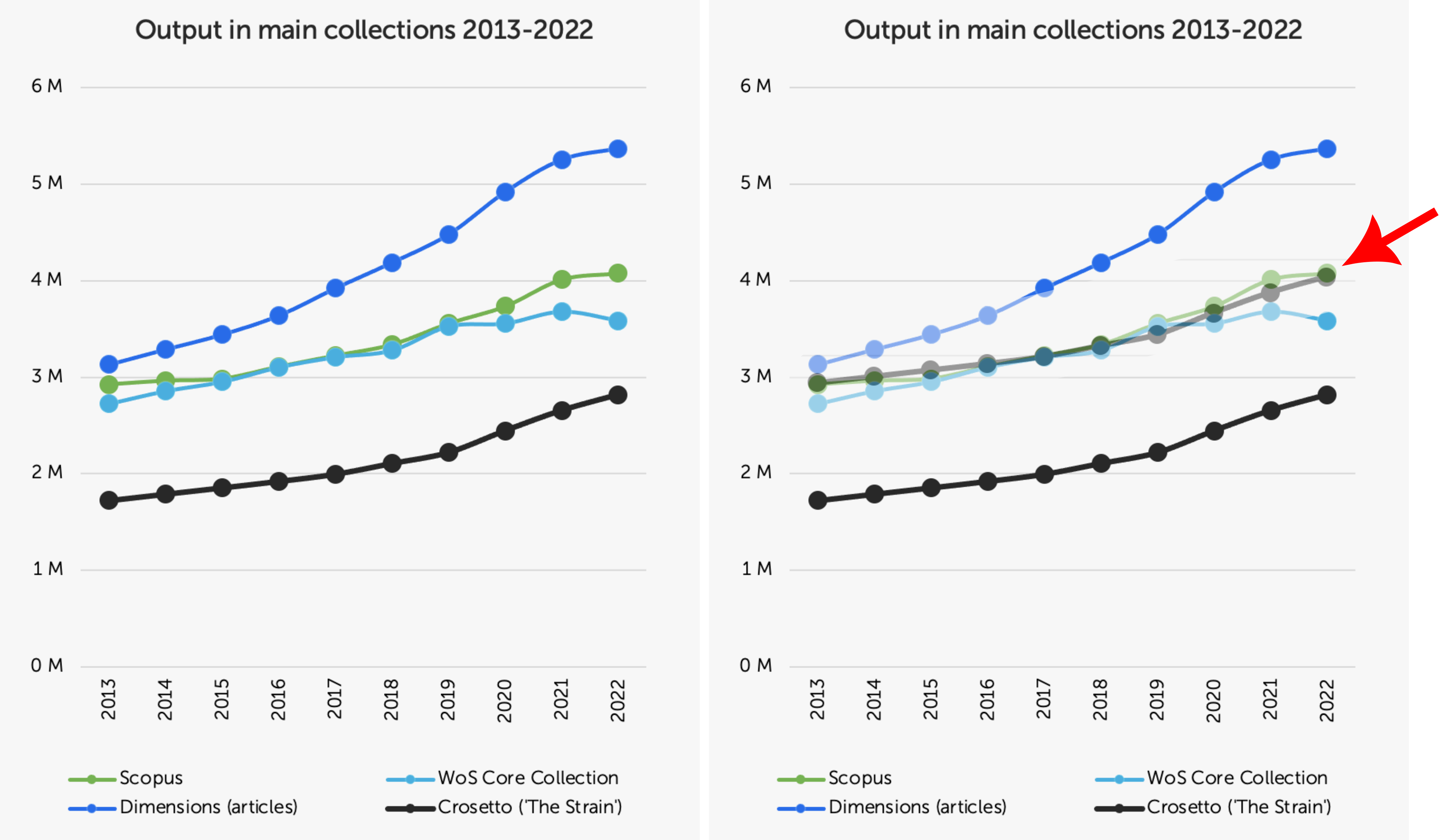
But to be sure we do not somehow mislead you with a trick of data visualisation, we crunched the numbers: the correlation between our data and Scopus is: Pearson’s r = 0.992. In fact, the correlation between our data and the Dimensions data Frontiers provided us is: Pearson’s r = 0.983. So even if you use Dimensions or Scopus instead, our data do paint the same picture.
Pillars made of soapstone: another example of claiming a result, not running any analysis, and then reaching a conclusion not supported by the figure is their “second pillar of strain”: the limited growth – if any – in the number of researchers. Here is Frontiers’ claim:
“The study uses PhD graduates as a proxy for active researchers who write, review, and edit articles when a more direct measure of active researchers is available… They ignore the upward trend available from the same data source they used (Figure 2B) and fail to mention or consider that PhD graduations were disrupted during the pandemic. A direct measure of the number of active researchers shows the opposite to what they claim – a continuous increase.”
Again, we never say there has been a decrease in researchers (see above). Frontiers then provides their Figure 2B and claims it shows a continuous increase in researchers.
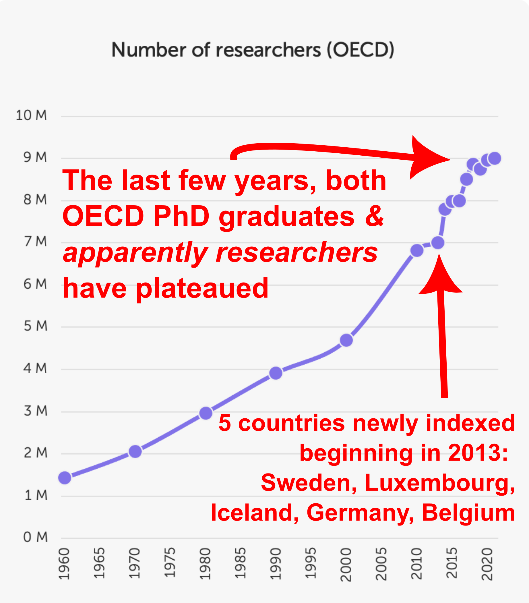
But we tend to see a plateau in this plot, similar to the plateau we saw in newly-minted PhDs. And again, the reduction in newly-minted PhDs was robust to inclusion of data from India and China (see Fig.1supp1 above). We further double checked this trend using UNESCO data on researchers per million, similar to what Frontiers has done here, finding a very limited growth in recent years. That’s why we only claimed that article growth had outpaced the growth - if any - in active researchers.
There are actually additional problems with the data that Frontiers plot here: the long timeframe they show is misleading because the countries indexed in the OECD dataset have evolved over time. Indeed, the huge spike in 2013 is due to the inclusion of many new countries, including Germany, explaining this large spike in total new researchers.
Further, Frontiers claims the COVID-19 pandemic is behind the plateauing of PhD graduates that we saw. However, this plateau, also seen in the total researchers data above, started in ~2017. So we can’t exactly attribute this to the pandemic. So again, none of what Frontiers claims is true: there has not been a continuous increase in total researchers, but rather the same plateau we saw in PhD graduate numbers - the agreement between these two metrics is also quite sensible, considering PhD graduates become researchers.
Frontiers actually validates our data: this response would not be complete without a look at Figure 2C. It purports to show the absence of correlation between total articles per year being generated and the number of Frontiers articles published in “Research Topics” (i.e. special issues). Frontiers plots the datasets of Scopus and Web of Science as lines, and then its own Research Topic articles as very small bars, choosing two different visualization styles within the same plot.
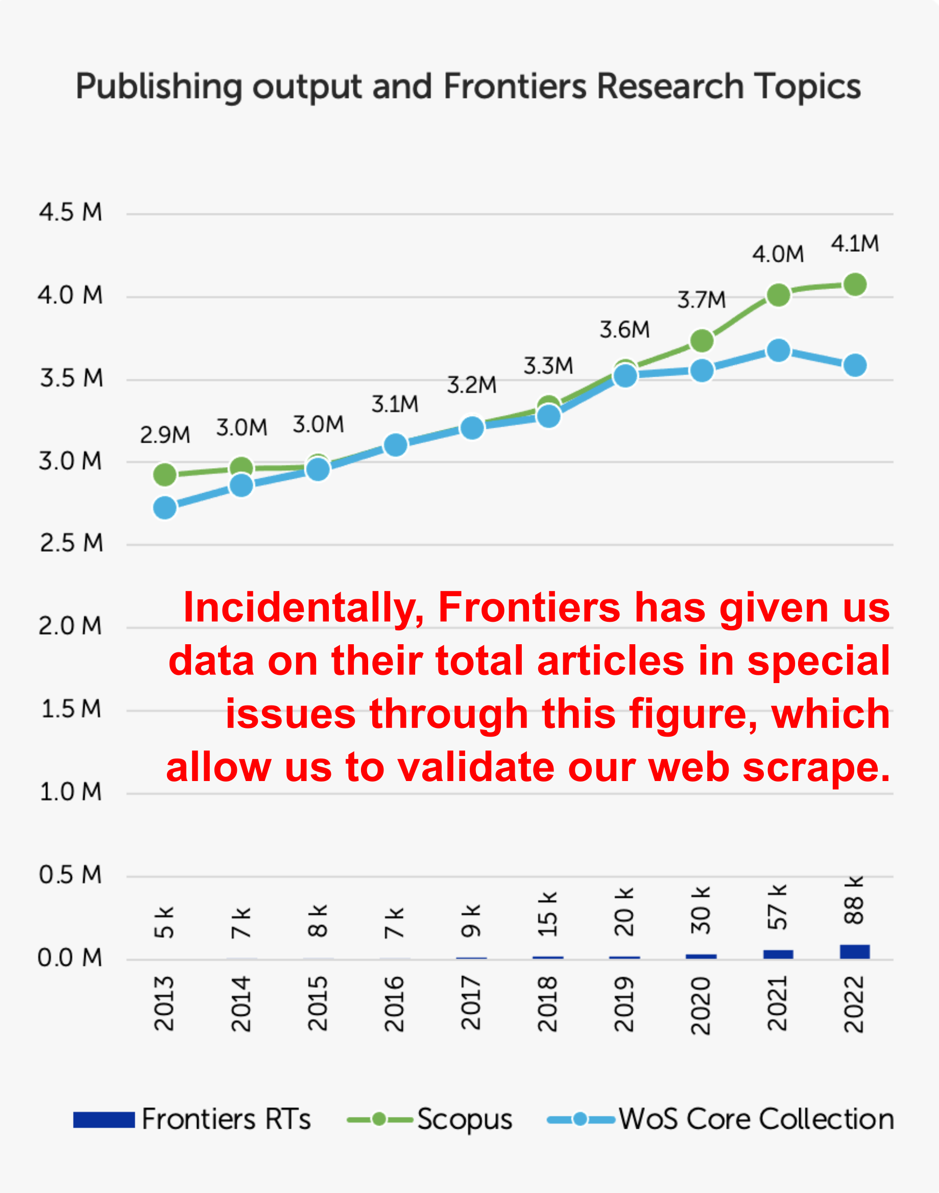
Briefly: there is actually quite a good correlation between total articles and Frontiers Research Topic articles per year. The correlation between the Scopus data in green and the Frontiers Research Topic data is: Pearson’s r = 0.912. Moreover, the growth in Frontiers Research Topic articles has been exponential: a mean year-over-year growth of 43%, far outpacing the overall strain (~6%).
But somewhat ironically: this plot actually validates our own scraped data from Frontiers. As we mentioned, we requested data from Frontiers on special issue article numbers so we could validate or even replace our web-scraped data, but they never sent us those data. But in this Figure 2C, in fact, Frontiers provides the data we requested. So, how did we do? It seems we were spot-on.
Our web-scraped dataset estimated 69.3% of articles in Frontiers were published through “Research Topics” (i.e. special issues). Applying this estimate to their 2022 output (125.1k articles) yields ~87k special issue articles in 2022 – the Figure here says 88k. Thus, our scrape of Frontiers articles yielded ~99% accuracy – pretty impressive given we only scraped the 49 journals from our study, while the 88k reflects all 200+ Frontiers journals. Thank you to Frontiers for providing these data that validates our web-scraping.
Conclusion
We started a conversation with Frontiers while we were working on our article. We offered them the chance to comment on our work before we released it publicly. This is a courtesy we also extended to other publishers. We were thus surprised to find this blog posted without our knowledge. Indeed, we had numerous emails with Frontiers in the lead-up to our work that were good-faith exchanges. We even have the original comments that Frontiers provided to us from when we sent them our draft article: they praised aspects of our work and provided constructive feedback, including correcting our phrasing to avoid ambiguous wording. We would be happy to share those comments, if Frontiers would give us permission to. We still thank Frontiers for those comments.
That is why it is so surprising to see this latest piece, which contains a startling level of animosity and many derogatory accusations that are simply untrue.
Others, including publishers, have welcomed our scientific countribution. Frontiers could have done the same. Instead, Frontiers has released this blog containing many analytical errors just one week after they published the questionable article on rodent genitalia. Of course mistakes happen, and Frontiers retracted that article swiftly. But this? This is something else. These are their own words, chosen intentionally.
We still want to thank specific employees at Frontiers with whom we had a respectful relationship. We made every effort we could to adhere to ethical research conduct. We had good faith, mutually beneficial exchanges with Frontiers. Thus why it is so disheartening to see this blog post and the tone it took. We hope Frontiers will reflect on what they’ve said, how they’ve said it, and choose to engage with us more productively in the future.
We wrote the Strain paper because we wanted there to be more transparency over the data that publishers control on academic publishing; because we thought we needed a more strongly data-driven conversation about publishing trends; because some of the contributions to that conversation are misguided, dysfunctional and require rectifying, and because we think researchers need to scrutinise publishers’ data if they are to be effectively analysed and interpreted. We cannot assume publishers will do that well.
The Frontier’s blog confirms us in that view.
Sincerely,
Mark A. Hanson, Pablo Gómez Barreiro, Paolo Crosetto, Dan Brockington